 | Chapter 14 Creating GUI Components |  |

| Chapter 14 Creating GUI Components | |
One of the big advantages of Java 1.1 is the addition of a
ScrollPane container. Previously, unless
you were working with a text component, you had to manage scrolling
yourself. It wasn't terribly difficult, but it was a pain: you had to
create Scrollbar objects, attach them to
whatever you were scrolling,
and redisplay everything with new positions whenever the user made an
adjustment. ScrollPane does it all for
you. About the only time you absolutely need a
Scrollbar is when you want to create a
"volume control-type" object. For example, you might want to create a
paint mixer that blends different amounts of red, blue, and green,
depending on some scrollbar settings.
The unifying theme behind both ScrollPane
and Scrollbar is the
Adjustable
interface, which defines the responsibilities of scrollable objects.
An object that implements Adjustable lets
you modify an integer value through some fixed range. When a user
changes the value, the object generates an
AdjustmentEvent; as you might expect, to
get an AdjustmentEvent, you must implement
AdjustmentListener and register by calling
addAdjustmentListener(). Scrollbars
implement Adjustable, and ScrollPane can return
Adjustable objects for each of its
scrollbars.[2]
[2] There may be a bug in the
Adjustableobjects you get fromScrollPane. Although you can read their settings, you can't change them; methods likesetMinimum()andsetMaximum()(which should set the object's minimum and maximum values) throw anAWTError.
In this section, we'll demonstrate both the
ScrollPane and
Scrollbar classes. We'll start with a
ScrollPane.
Technically, ScrollPane is a
Container, but it's a funny one. It has
its own layout manager, which can't be changed. It can only accommodate
one component at a time. This seems like a big limitation, but it
isn't. If you want to put a lot of stuff in a
ScrollPane, just put your components into
a Panel, with whatever layout manager you
like, and put that panel into the
ScrollPane.
When you create a ScrollPane, you can
specify the conditions under which its scrollbars will be displayed.
This is called the scrollbar display policy; you can specify the
policy by using one of the three constants below as an argument to the
ScrollPane constructor:
SCROLLBARS_AS_NEEDEDDisplays scrollbars only if the object in the
ScrollPane doesn't fit.
SCROLLBARS_ALWAYSAlways displays scrollbars, regardless of the object's size.
SCROLLBARS_NEVERNever displays scrollbars, even if the object is too big. If you use
this policy, you should provide some other way for the user to
manipulate ScrollPane.
By default, the policy is
SCROLLBARS_AS_NEEDED.
Here's an applet that uses a ScrollPane to
display a large image. As you'll see, the applet itself is very
simple; all we do is get the image, set the applet's layout manager,
create a ScrollPane, put the image in our
pane, and add the ScrollPane to the
applet. To make the program slightly cleaner, we create an
ImageComponent component to hold the image,
rather than placing the image directly into the
ScrollPane. Here's the applet itself:
import java.awt.*;
public class ScrollPaneApplet extends java.applet.Applet {
    public void init() {
        Image image = getImage( getClass().getResource(getParameter("image")) );
        setLayout(  new BorderLayout() );
        ScrollPane scrollPane = new ScrollPane();
        scrollPane.add( new ImageComponent(image) );
        add( "Center", scrollPane );
    }
}
And here's the ImageComponent. It waits for
the image to load, using a
MediaTracker, and sets its size
to the size of the image. It also provides a
paint()
method to draw the image. This takes a single call to
drawImage(). The first argument is the
image itself; the next two are the coordinates of the image relative
to the ImageComponent; and the last is a
reference to the ImageComponent itself
(this), which serves as an image observer.
(We'll discuss image observers in Chapter 17; for the time being, take
this on faith.)
import java.awt.*;
class ImageComponent extends Component {
    Image image;
    Dimension size;
    ImageComponent ( Image image ) {
        this.image = image;
        MediaTracker mt = new MediaTracker(this);
        mt.addImage( image, 0 );
        try { mt.waitForAll(); } catch (InterruptedException e) { /* error */ };
        size = new Dimension ( image.getWidth(null), image.getHeight(null) );
        setSize( size );
    }
    public void update( Graphics g ) {
        paint(g);
    }
    public void paint( Graphics g ) {
        g.drawImage( image, 0, 0, this );
    }
    public Dimension getPreferredSize() {
        return size;
    }
}
ImageComponent also supplies an update()
method that calls paint().
As we'll see later, the default version of
update() automatically clears the screen,
which wastes time if we already know that our image will cover the
entire screen. Therefore, we override
update() so that it doesn't bother
clearing the screen first. Finally, ImageComponent provides a
getPreferredSize() method, overriding the
method it inherits from Component. This
method simply returns the image's size, which is a
Dimension object. When you're using ScrollPane, it's important for the object
you're scrolling to provide a reliable indication of its size,
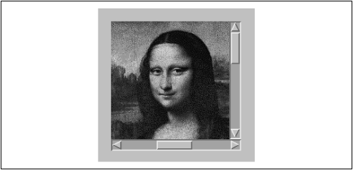
particularly if the object is a lightweight component. Figure 14.8 shows the ScrollPaneApplet with the ImageComponent.
Our next example is basically the same as the previous one, except that it
doesn't use the ScrollPane; it implements
its own scroller using scrollbars. With Java 1.1, you don't
have to write code like this, but it does show how much work the
ScrollPane saves and also demonstrates
how to use scrollbars in other situations.
Our applet is called
ComponentScrollerApplet; it uses a
home-grown scrollpane called
ComponentScroller. In appearance, it is identical to the ScrollPaneApplet (Figure 14.8). The component that we
scroll is the ImageComponent we developed in
the previous example.
Now let's dive into the code for
ComponentScrollerApplet:
import java.awt.*;
import java.awt.event.*;
public class ComponentScrollerApplet extends java.applet.Applet {
    public void init() {
        Image image = getImage( getClass().getResource(getParameter("image")) );
        ImageComponent canvas = new ImageComponent( image );
        setLayout(  new BorderLayout() );
        add( "Center", new ComponentScroller(canvas) );
    }
}
class ComponentScroller extends Container {
    Scrollbar horizontal, vertical;
    Panel scrollarea = new Panel();
    Component component;
    int orgX, orgY;
    ComponentScroller( Component comp ) {
        scrollarea.setLayout( null );  // We'll handle the layout
        scrollarea.add( component = comp );
        horizontal = new Scrollbar( Scrollbar.HORIZONTAL );
        horizontal.setMaximum( component.getSize().width );
        horizontal.addAdjustmentListener( new AdjustmentListener() {
            public void adjustmentValueChanged(AdjustmentEvent e) {
                component.setLocation( orgX = -e.getValue(), orgY );
            }
        } );
        vertical = new Scrollbar( Scrollbar.VERTICAL );
        vertical.setMaximum( component.getSize().height);
        vertical.addAdjustmentListener( new AdjustmentListener() {
            public void adjustmentValueChanged(AdjustmentEvent e) {
                component.setLocation( orgX, orgY = -e.getValue() );
            }
        } );
        setLayout( new BorderLayout() );
        add( "Center", scrollarea );
        add( "South", horizontal );
        add( "East", vertical );
    }
    public void doLayout() {
        super.doLayout();
        horizontal.setVisibleAmount( scrollarea.getSize().width );
        vertical.setVisibleAmount( scrollarea.getSize().height );
    }
}
What do our new components do? Let's start at the top
and work our way down. The applet itself
is very simple; it does all of its work in
init(). First it sets its layout manager
to BorderLayout. Then it acquires an
Image object with a call to
getImage().
Finally, the applet creates an ImageComponent
to hold our image, creates a
ComponentScroller to hold the
ImageComponent, and adds the scroller to the
"Center" region of the layout. I chose
BorderLayout because it resizes its
central component to fill the entire area available.
Next comes the ComponentScroller
itself. ComponentScroller takes a
reference to our ImageComponent in its
constructor. It adds the component it will be scrolling to a
Panel with no layout manager. It then
creates horizontal and vertical
Scrollbar objects
(HORIZONTAL and
VERTICAL are constants of the
Scrollbar class, used to specify a
scrollbar's direction), sets their maximum
values using the height and width of the
Panel, and registers an
AdjustmentListener for each scrollbar. The
AdjustmentListener is an anonymous inner
class that implements the
adjustmentValueChanged() method. This
method is called whenever the user moves the scrollbar. It extracts
the new scrollbar setting from an
AdjustmentEvent and uses this to move the
component we're scrolling to its new location. We have a separate
listener for each scrollbar, so we don't have to figure out which
scrollbar generated the event. The listener for the horizontal
scrollbar adjusts the component's x coordinate
(orgX) and leaves its y coordinate
unchanged; likewise, the listener for the vertical scrollbar adjusts
the component's y coordinate. By adjusting the location of the
ImageComponent, we control
how much of the image is displayed; anything that falls outside of the
scroller's Panel
(scrollarea) isn't displayed.
The ComponentScroller overrides the
doLayout() method of the
Container class. This gives us an
opportunity to change the size of the scrollbar "handles" whenever the
scroller is resized. To do so, we call
super.doLayout() first, to make sure that
the container gets arranged properly; although we're overriding this
method, we need to make sure that it does its work. Then we call the
setVisibleAmount() method of each
scrollbar with the new width and height of the scrolling area.
So in review, we call setMaximum() to set
the vertical scrollbar's maximum value to the image's height; we call
setVisibleAmount() to tell the vertical
scrollbar how much area we have available, and it sets the size of its
"handle" accordingly. For example, if the image is 200 pixels high and the visible amount is 100 pixels, the scrollbar sets its handle to
be roughly half its length. We do similar things to the horizontal
scrollbar. As a result, the handles grow or shrink as we change the
size of the viewing area and indicate how much of the image is visible.
The setMaximum() and
setVisibleAmount() are both part of the
Adjustable interface, which scrollbars
implement. Other methods of this interface are listed in Table 14.1.
| Method | Description |
|---|---|
getOrientation() | Tells you whether the scrollbar is |
| Lets you control the size of the scrollbar's handle (slider). As we saw earlier, this is a convenient way to give the user a feel for the size of the object you're scrolling. |
| Lets you retrieve or change the scrollbar's current setting. |
| |
| |
| Lets you control the amount the scrollbar will move if the user clicks on the scrollbar's arrows; in many environments, this means the user wants to move up or down one line. |
| Lets you control the amount the scrollbar will move if the user clicks between an arrow and the slider; in many environments, this means the user wants to move up or down one page. |
|
It's worth asking why we put our image in a
Canvas,
which we then put into a Panel, which we
put into another Panel, which we put into
the applet. Surely there's a more efficient way. Yes there is, but we
wanted to make as many reusable components as possible. With this
design, you can use ImageComponent wherever
you need to display an image and check that it is loaded first; you
can use ComponentScroller wherever you
need to scroll any kind of component, not just an image or a
Canvas. Making reusable components is one
of the major advantages of object-oriented design; it's something you
should always keep in mind.
|  | |
| 14.6 Checkbox and CheckboxGroup |  | 14.8 Dialogs |
